Simplifying Data Visualization: Clearer Insights, Happier Stakeholders
Data visualization is a powerful tool for transforming complex data into more easily digestible information. It is an essential part of any data analysis process, as it can help to communicate findings to stakeholders in a clear and concise manner. However, not all visualizations are created equal, and utilizing certain best practices can result in more effective communication.
Choose the Right Chart Style
Is the visualization you are using communicating your message in the best manner?
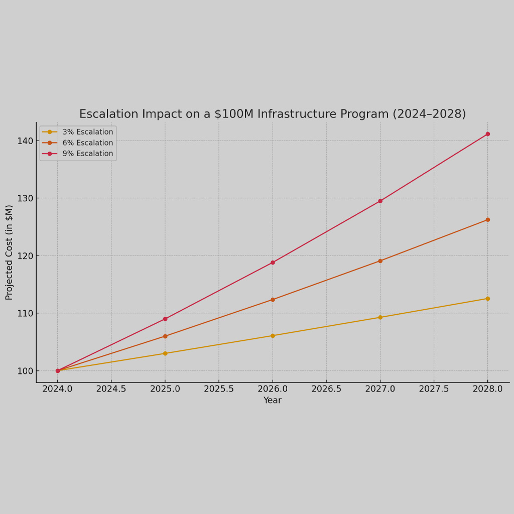
Different styles of charts are better suited for each type of data. For example, a bar chart may be best for comparing values between categories, while a line chart is better for showing trends over time. Pie charts are often used to show proportions, but can be difficult to interpret if there are too many segments or if the data is not evenly distributed.
Consider the Audience
Who are you communicating with?
For effective communication, understanding the audience’s background and level of familiarity with the data must be part of the planning process. If the audience is not familiar with the data, it is likely better to choose a simpler chart style that is easier to interpret or break the information down into multiple simpler charts. On the other hand, if the audience is highly knowledgeable about the data, a more complex chart with more variables may be appropriate.
Simplifying the Design
Are you trying to look fancy or communicate a message?
A cluttered or confusing visualization can be difficult to interpret and may lead to inaccurate conclusions. When designing a visualization, it is important to remove unnecessary clutter and distractions. This can be achieved by using a simple color scheme, reducing the number of data points, and using clear and concise labels.
Clear Labels and Titles
Is your chart really as intuitive as you think?
The labels and titles should accurately reflect the data being presented and should be easy to understand. The labels should be placed next to the data points they represent, and the titles should provide a clear summary of the visualization. Clear labeling can help prevent misunderstandings and ensure that the visualization is interpreted correctly.
Provide Context
If your chart was in the newspaper would readers understand it without your presentation?
Context can help the audience understand the significance and relevance of the data being presented. This can be achieved by adding reference lines, annotations, or additional data sets. For instance, a line chart showing the performance of a company over time could be augmented by adding reference lines indicating major events or milestones in the company’s history. This context can help the audience understand the factors that have influenced the company’s performance.
Effective data visualization requires choosing the right chart style, simplifying the design, using clear labels and titles, and providing context. By following these best practices, you can create visualizations that effectively communicate your findings and insights to stakeholders. Remember to always consider your audience, their level of familiarity with the data, and to test your visualizations to ensure they are effective. With these best practices in mind, you can transform complex data into valuable insights that drive informed decision-making.
At Front Line Advisory Group (FLAG), we are providing change management services to help municipalities collect and analyze data, improve stakeholder communication, leverage technology, develop training plans, and more. We believe these are the most effective and affordable ways for municipalities to scale their capabilities. Contact us for more info at info@frontlineadvisorygroup.com.