“Without data, you’re just another person with an opinion.”
– W. Edwards Deming
The Complexity of Modern Capital Programs
Managing a capital improvement or infrastructure program is like orchestrating a symphony of projects, tasks, and moving parts. These programs generate an immense volume of information – from schedules and budgets to risk logs and status reports – which can overwhelm traditional reporting methods. The sheer complexity and scale make it challenging for municipal leaders and project teams to maintain clarity. This is why a concise “control center” dashboard is so critical. A well-designed dashboard acts as a mission control, sifting through the noise of project data and distilling it into an easily digestible visual summary. Instead of flipping through dozens of spreadsheets and documents, decision-makers get a high-level view of all key information in one place. In short, dashboards provide a single source of truth, giving program managers real-time insight into progress and performance without information overload.
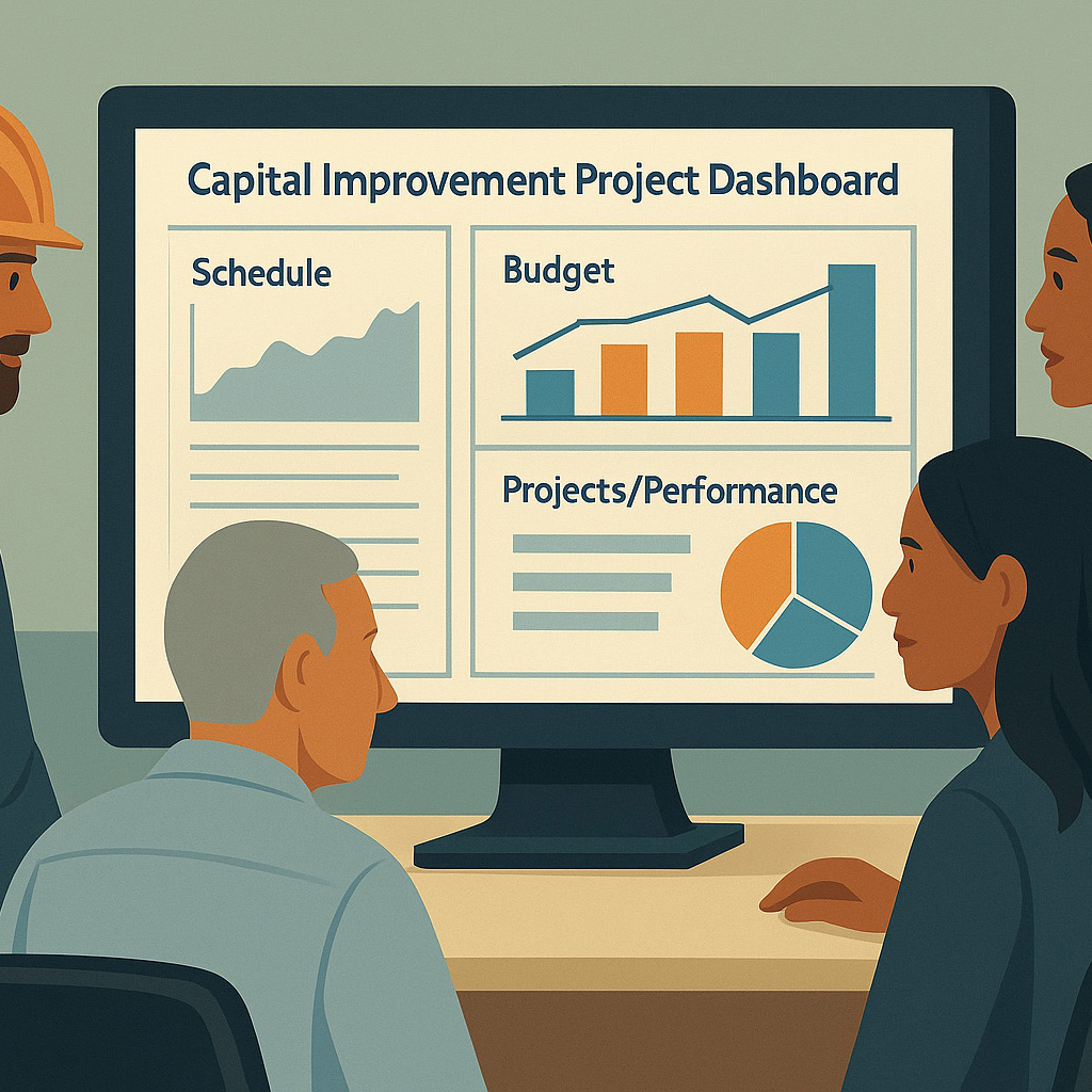
Modern dashboards allow project leaders to monitor complex program data on user-friendly visual interfaces in real time. By consolidating charts, graphs, and key metrics onto a single screen, a dashboard functions as a mission control center – providing at-a-glance insight into a program’s status and health.
Real-Time Oversight and Smarter Decision-Making
One of the greatest advantages of a dashboard is the real-time oversight it offers. In large infrastructure programs, conditions can change daily – a contractor falls behind schedule, a change order increases the budget, or a risk suddenly escalates. Dashboards tap into live data feeds so that these developments are reflected immediately. This up-to-date visibility enables management to respond promptly and appropriately. In fact, stakeholders across an organization benefit from having “real-time, single version of the truth” dashboards to monitor and evaluate project performance. When all parties are looking at the same current numbers, it’s far easier to spot issues early. For example, an executive can see a red flag on the schedule today and convene a solution before a small delay balloons into a big problem. Such granular oversight – even the ability to drill down from summary figures into the details – gives leaders confidence that nothing is slipping through the cracks. Moreover, automating performance monitoring in a dashboard dramatically reduces manual reporting effort, freeing project managers to focus on strategic decisions rather than compiling spreadsheets. The result is faster, more informed decision-making at every level of the program.
Keeping Everyone on the Same Page
Dashboards also shine as a communication tool for both internal and external stakeholders. Within a project team, a dashboard creates a central hub of information that all departments and contractors can access. This means engineers, contractors, and administrators are literally on the same page, looking at the same data. Miscommunications are minimized because everyone draws from the dashboard’s up-to-date figures rather than outdated memos or separate reports. As one industry expert put it, dashboards act as a “conduit” for stakeholder collaboration – giving all parties access to the same real-time project data and even enabling them to work with each other through that shared platform. When each stakeholder – whether a city finance officer or a construction site manager – can customize and view the data relevant to their needs, it aligns their priorities while keeping the overall mission in view.
Equally important, dashboards greatly improve communication with external stakeholders like constituents and project sponsors. For public agencies managing capital improvement programs, transparency is paramount. Dashboards provide a window into the program that can be shared with oversight boards or even citizens in the community. Instead of dense reports, officials can present constituents with an easy-to-understand visual update on how projects are progressing. Many local governments are now leveraging public-facing dashboards to foster transparency and build trust, presenting large amounts of data in a user-friendly format for residents. A project dashboard is a quick way to inform outside stakeholders – for example, showing taxpayers that a bond-funded infrastructure project is on schedule and on budget. This level of openness keeps sponsors and the public engaged and supportive, since they can plainly see the program’s status and impacts. In short, a dashboard translates complex project data into a common visual language for all stakeholders, strengthening accountability and confidence across the board.
Power BI and the Data-Driven Revolution in Construction
In recent years, the construction and infrastructure industry has undergone a quiet revolution thanks to modern business intelligence tools. Platforms like Microsoft Power BI have emerged as one of the most significant technological advancements in how projects are managed. These tools make it possible to automatically pull data from multiple sources – schedules, budgets, risk registers, procurement systems, etc. – and aggregate them into dynamic dashboards with rich visuals. The impact on the industry has been profound: tasks that once took project controls teams weeks of spreadsheet wrangling can now be done in near real time with interactive charts. Data-driven decision making has become the new norm. In fact, Power BI’s ease of use and integration with existing systems (like the ubiquitous Excel) has led to explosive adoption worldwide. Today we see Power BI dashboards sitting on project managers’ desktops right alongside familiar tools like AutoCAD or Revit. This means that on most major projects – whether a highway expansion or a water treatment plant upgrade – it’s now standard to have a live dashboard tracking all the key performance indicators. The embrace of tools like Power BI has truly democratized project analytics; you no longer need to be a data scientist to create a useful dashboard. Construction teams around the globe, from the United States to Europe, the Middle East, and Asia, are using these platforms to achieve new levels of insight. For example, the team behind the U.K.’s High Speed 2 rail project moved from massive Excel reports to Power BI dashboards, finding that interactive charts and automated data updates greatly improved their reporting efficiency. The bottom line is that modern dashboards, often built on Power BI, have become a standard tool on large capital programs, enabling a culture of real-time, data-driven management that simply wasn’t possible a decade ago.
Key Metrics and Visualizations for Program Success
Not all dashboards are created equal – the most effective ones focus on the key metrics and visualizations that keep a capital improvement program on time, on budget, and in compliance. Here are some of the critical metrics and dashboard elements that program managers and stakeholders rely on to monitor performance:
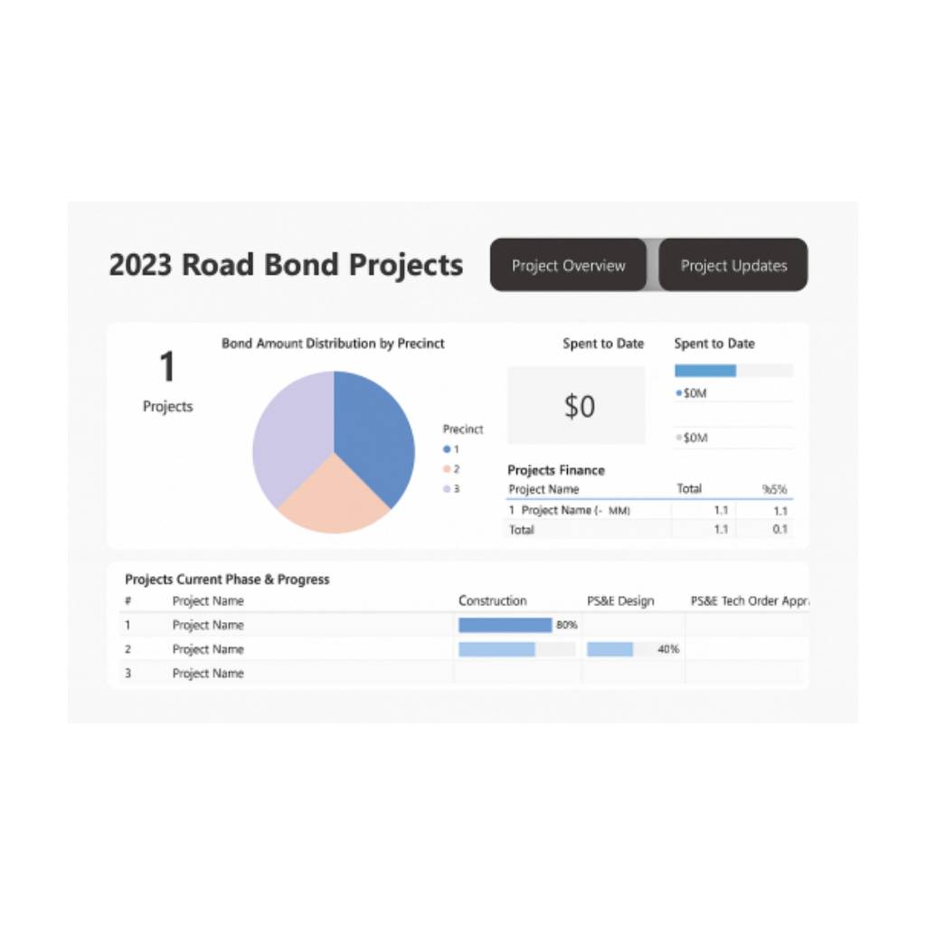
- Project Milestones & Schedule Progress: An effective dashboard highlights major milestones and timeline metrics so you can see if the program is on schedule. This might include a simple timeline or Gantt chart showing completed and upcoming milestones, and perhaps a red-amber-green status indicator for schedule health (e.g. tasks behind schedule flagged in red). At a glance, leaders can identify any delays and intervene early. For instance, a “% Complete” indicator or a list of tasks that are overdue will quickly signal if a project phase is slipping. Fast identification of milestones that are falling behind is crucial – dashboards excel at surfacing which aspects of the project are underperforming and why.
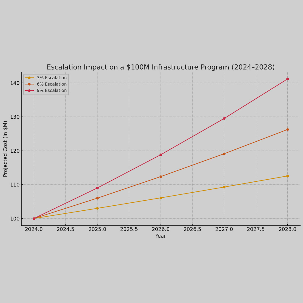
- Budget vs. Actual Financials: Keeping capital programs on budget is just as important as staying on schedule. Dashboards therefore include clear visuals for financial performance – often a comparison of the budgeted cost vs. actual expenditures to date, and forecasts of costs at completion. For example, a dashboard may show that a project is 50% complete but has used 60% of its budget, indicating a potential cost overrun. Graphs like budget vs. actual bar charts or an S-curve of cumulative spending help pinpoint variances. With all financial data in one place, stakeholders can immediately see if spending is on track or if corrective actions (like cost-cutting or securing additional funds) are needed. Including metrics like percent of budget spent and forecasted final cost makes it easier to ensure fiscal accountability. In short, the dashboard serves as an early warning system for cost control.
- Risk and Issue Tracking: Large infrastructure programs inevitably face risks (e.g. supply chain delays, permitting issues) and active problems that need resolution. Risk and issue dashboards consolidate this information so managers can identify and address threats proactively. A common feature is a risk register summary – listing key risks, their status, and mitigation actions – or a risk heat map visualization highlighting the highest-impact risks in red. Dashboards might show, for instance, that there are 5 “high” risks this month (such as potential funding shortfall or contractor delay) up from 3 last month, prompting discussion on mitigation. By tracking issues and flagged risks in real time, dashboards ensure no known problem is ignored. This visibility also promotes accountability as each risk has an owner and a plan. Stakeholders can drill down into a particular issue’s details directly from the dashboard if something looks alarming. As noted earlier, having such real-time visibility into risks means teams can react faster and prevent minor issues from snowballing.
- Procurement & Contract Status: In capital programs, procurement and contracting activities are the lifeblood that keep projects moving – from awarding design contracts to purchasing materials and hiring contractors. Effective dashboards include metrics to track procurement timelines and contract statuses. For example, a dashboard may list all major contracts and show their award status (bids open, awarded, under negotiation) and any critical due dates. If a contract critical to Project A’s start date is delayed, the dashboard makes that visible to all, so adjustments can be made. Tracking procurement metrics helps ensure that long lead items and services are secured in time to not delay construction. At a program level, seeing how many contracts are still pending versus completed can indicate if the program is on track in its early phases. Procurement KPIs (like number of contracts awarded on schedule, or percentage of budget under contract) are therefore valuable for program oversight. Additionally, dashboards can show compliance with procurement policies or local requirements (e.g. minority business participation targets), which is important for public programs.
- Change Orders and Scope Changes: Scope creep and change orders can be budget-busters and schedule disrupters if not managed closely. A good capital program dashboard will track change orders – typically displaying how many change orders have been approved, their cumulative cost impact, and any schedule changes associated with them. This might be presented as a simple counter (e.g. “Change Orders: 7 (+$2.1M)”) or a chart of approved vs. pending changes. By highlighting outstanding change orders and their impact, the dashboard keeps management aware of scope changes in real time. For example, if the budget dashboard shows the original budget and the current forecast including all approved changes, one can quickly see how much contingency has been consumed by change orders. Program sponsors and executives absolutely need this visibility – many a project has gone off-track due to unmanaged changes. Dashboards that clearly show change order trends enable more disciplined scope management. They also facilitate transparency: everyone from the project manager to the sponsor can see how scope changes are affecting the project’s bottom line.
- Safety and Compliance Indicators: Capital programs must adhere to various regulatory requirements – from building codes and environmental regulations to safety standards on construction sites. Safety and compliance dashboards surface these critical indicators to ensure nothing is overlooked in these non-negotiable areas. For instance, a dashboard might display the number of safety incidents or accidents month-to-date, so that any spike can prompt immediate action. It can also track permit approval status (e.g. permits pending vs. obtained), inspections passed, or other compliance tasks. Regulatory compliance indicators give leadership a quick read on whether the program is meeting its legal and ethical obligations. A great example is a safety dashboard that might show a green check if all required safety trainings are up to date and no major incidents occurred this quarter, or a warning icon if there’s been a recent OSHA recordable incident. Some dashboards include a dedicated Safety & Compliance section to ensure all standards are being met, providing a clear overview of compliance metrics and flagging any issues. By having these measures front and center, organizations foster a culture of safety and responsibility. Moreover, when communicating to the public or oversight boards, being able to demonstrate compliance (e.g. “0 environmental violations” or “100% of permits in place”) builds confidence in the program’s management.
Each of these metrics and visualizations contributes to a holistic view of program health. The best dashboards integrate them into a concise layout (often one or two pages maximum) so that stakeholders can get the full picture at a glance. For example, a program manager might start their day by scanning the dashboard: checking that milestones are on track, budget is within range, no new high-level risks have appeared, procurements are moving, change orders are under control, and safety is green. If anything looks off, they know exactly where to dig deeper. This comprehensive yet focused approach is how dashboards keep capital improvement programs on time, on budget, and in compliance – by continuously monitoring all critical success factors and presenting them in a readily understandable form.
A New Standard for Program Management
Dashboards have evolved from a novel gadget into an essential tool in capital program management. In the past, program managers might have relied on thick binders of reports or siloed spreadsheets to understand project status – often reacting to issues after they had already caused damage. Today, a concise dashboard can tell the story of a complex infrastructure program in seconds, with data updated to the minute. This capability is transforming how municipal leaders and industry professionals exercise oversight: decisions are now grounded in current facts and visible trends, not weeks-old reports. Dashboards also transform stakeholder relationships – when the public and project sponsors can visually grasp how a project is progressing, it builds trust through transparency and frequent communication. From big-city capital improvement plans in the United States to multi-billion-dollar infrastructure programs overseas, the consensus is clear: having a central dashboard for program management is no longer optional, but expected. It’s becoming standard practice to launch a dashboard alongside the kickoff of any major program, establishing a culture of accountability and agility from day one.
In summary, a well-crafted dashboard serves as the nerve center of a capital improvement program. It distills complexity into clarity, enabling leaders to see the big picture and the fine details all at once. With real-time data, powerful visualization tools, and the ability to share insights broadly, dashboards enhance oversight and collaboration in ways that profoundly improve project outcomes. For anyone involved in delivering infrastructure – be it a city manager, a construction firm executive, or an interested citizen – dashboards provide confidence that the program is being actively monitored and managed towards success. Embracing these data-driven control centers is a smart move for any organization looking to keep their capital projects on track and aligned with their goals in today’s fast-paced, information-rich world.
Front Line Advisory Group (FLAG) is a Program Management Consulting (PMC) firm focused on delivering bond-funded infrastructure projects on time and on budget through disciplined management and data-driven controls. Our mission extends beyond consultation – we empower our clients to realize the full potential of their investments, ensuring tax dollars are put to maximum use through astute Program Management Consulting. For more information or to commence your journey towards transformative bond management, reach out to us at Info FLAG
References
- InEight Blog – “Benefits of Data Dashboards for Your Capital Projects” (Jan 18, 2022) (Benefits of Data Dashboards for Your Capital Projects | InEight Blog) (Benefits of Data Dashboards for Your Capital Projects | InEight Blog)
- Mastt Blog – “The Power of Project Management Dashboards for Capital Projects” (Sep 2, 2024) (The Power of Project Management Dashboards for Capital Projects [Examples + Guide]) (The Power of Project Management Dashboards for Capital Projects [Examples + Guide])
- Mastt Blog – “The Ultimate Construction Dashboard for Capital Projects” (Feb 27, 2025) (The Ultimate Construction Dashboard for Capital Projects) (The Ultimate Construction Dashboard for Capital Projects) (The Ultimate Construction Dashboard for Capital Projects)
- Contruent Blog – “Shared Dashboards Improve the Way Stakeholders Communicate and Collaborate” (Oct 2023) (Shared Dashboards Improve the Way Stakeholders Communicate and Collaborate – Contruent) (Shared Dashboards Improve the Way Stakeholders Communicate and Collaborate – Contruent)
- ClearPoint Strategy – “Public Dashboards: A Catalyst for Local Government Transparency” (2023) (Boost Local Government Trust with Public Dashboards)
- ClearPoint Strategy – “Essential Guide to Project Dashboards” (Essential Guide to Project Dashboards: Definition & Examples) (Essential Guide to Project Dashboards: Definition & Examples)
- Proving Ground – “BI Adoption in Architecture and Construction” (Apr 12, 2021) (Business Intelligence – 5 Drivers for Adoption in Architecture and Construction – PROVING GROUND) (Business Intelligence – 5 Drivers for Adoption in Architecture and Construction – PROVING GROUND)
- PMWeb Blog – “Dashboards for Capital Construction Projects Delivery” (Nov 3, 2021) (What Digitally Enabled Performance Monitoring, Evaluating and Reporting Dashboards Are Needed by Entities Involved in Capital Construction Projects Delivery? – PMWeb) (What Digitally Enabled Performance Monitoring, Evaluating and Reporting Dashboards Are Needed by Entities Involved in Capital Construction Projects Delivery? – PMWeb) (What Digitally Enabled Performance Monitoring, Evaluating and Reporting Dashboards Are Needed by Entities Involved in Capital Construction Projects Delivery? – PMWeb)
- HS2 (UK) Learning Legacy – “PowerBI in Performance Management Reporting” (2022) (PowerBI and its use in performance management reporting – HS2 Learning Legacy)